 Lightning Components
Lightning Data Table – Tailored to your needs
The UI base component of lightning data table allow you to have a full functioning data table with Salesforce Lightning Design System (SLDS).
All we need to do is to configure the data and columns based on the data payload and voila.
This article will try to give some practical examples and the TDLR; of the documentation.
Exploring the data table functions here will be useful to start using the native functionality that comes with this great magical component.
Let’s get started
Basic Lightning Data table HTML markup :
<!-- LWC -->
<lightning-datatable
   key-field="entityId"
   data={data}
   columns={columns}
   hide-checkbox-column="true">
</lightning-datatable>
Open in playground
The Basic required attributes are :
keyField– is required for correct table behavior. It associates each row with a unique identifier.data– will accept the array of data to be displayed.columns– Array of the columns object that’s used to define the data types.- Required properties include ‘label’, ‘dataKey’, and ‘type’. The default type is ‘text’.
Few Commons Optional Attributes (for LWC turn them into kabab-case notation)
hideCheckboxColumn(boolean) – Hides or displays the checkbox column for row selection. To hide the checkbox column, set hideCheckboxColumn to true. The default is false.hideTableHeader(boolean) – Specifies whether the table header should be hidden.showRowNumberColumn(boolean) – Shows or hides the row number column. Set to true to show the row number column. The default is false.sortedDirection(boolean) – Specifies the sorting direction. Sort the data using the onsort event handler. Valid options include ‘asc’ and ‘desc’.- All Other Available component attributes
- The Support features are listed here.
The Rows Data in the Table body
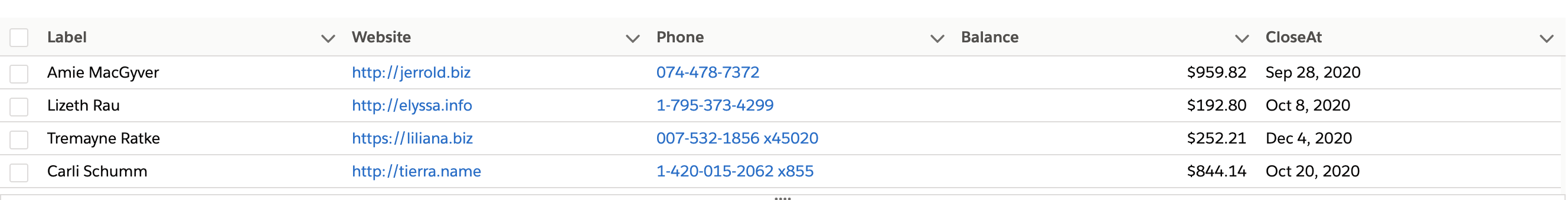
For this Example, lets assume we have the following data array of prospects information :
const data = [
    {
      "entityId": "1",
      "entityName": "Guitar shop",
      "entityType": "Prospect",
      "createdDate": "2020-20-03",
      "amount": 1234.54,
      "phone": "+44-123456789",
      "website": "www.guitars.com",
      "status": "active"
    },
    {
      "entityId": "2",
      "entityName": "Food shop",
      "entityType": "Customer",
      "createdDate": "2020-20-03",
      "amount": 2234.54,
      "phone": "+44-123456789",
      "website": "www.food.com",
      "status": "suspended"
    }
  ];
The “art” starts when you structure your data payload and correlate it with your columns properly.
Define your table columns
The Basic columns format:
const columns = [
    {
      "label": "Name",
      "fieldName": "entityName",
      "type": "text",
      "editable": true // supports editable cell
    },
    {
      "label": "Type",
      "fieldName": "entityType",
      "type": "text"
    }
  ];
Required basic column attributes :
label– The text label displayed in the column header.fieldName– The name that binds the columns properties to the associated data. Each columns property must correspond to an item in the data array.type– The data type to be used for data formatting.
Optional common columns attributes to be added:
cellAttributes(object) – Provides any additional customization. such as horizontal alignment or appending an icon to the output adding styling class and many others.typeAttributes(object) – Provides custom formatting with component attributes for the data type.actions(object) – Appends a dropdown menu of actions to a column. You must pass in a list of label-name pairs.editable(boolean) – Specifies whether a column supports inline editing. The default is false.sortable(boolean) – Specifies whether the column can be sorted. The default is false.wrapText(boolean) – Specifies whether text in a column is wrapped when the table renders. Wrapped text vertically expands a row to reveal its full content. Use with wrapTextMaxLines to display a number of lines before hiding the rest.iconName(string) – The Lightning Design System name of the icon.
Which data format Types can I use for data-table cells?
scroll down in documentation to find the full list on Formatting with Data Types.
lightning data table can display and format the columns with appropriate data types.
Below is the short list of the useful types :
- text, boolean, date, currency, email, number, percent, url
- action, button, button-icon
Each holds a different set of attributes which correlate to the typeAttributes or cellAttributes you apply to your column.
Example for typeAttributes :
const columns = [ {
      label: 'Website',
      fieldName: 'website' ,
      type: 'url',
      typeAttributes: {
             label : { fieldName: 'website' },
             target : { fieldName: '_BLANK' },
             tooltip : 'will navigate to company website'
         }
     }];
Notice that the type attributes can accept dynamic values using and object with fieldName attribute with the respected data row value.
This can be useful when it comes to dynamically assign attributes to your cells. For example when you wish to style your values inside cells.
Example for cellAttributes :
const columns = [ {
         label: 'Amount',
         fieldName: 'amount',
         type: 'currency',
         cellAttributes: {
           class:'slds-text-color_success', // static CSS class
           alignment: 'right'
         }
  },
  {
        label: 'Status',
        fieldName: 'status',
        type: 'text',
        cellAttributes: {
            class:{ fieldName: 'statusClass' } // dynamic CSS class
         }
   },
   {
        label: "Created Date",
        fieldName: "createdDate",
        type: "date",
        typeAttributes:{
            weekday: "long",
            year: "numeric",
            month: "long",
            day: "2-digit"
        }
    }
    // other column data
];
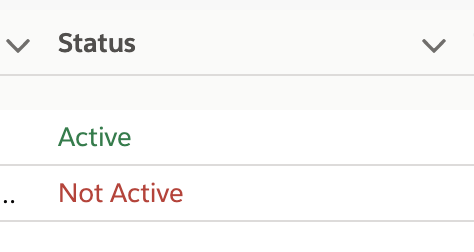
The above example will style the status column based on the value of the cell. It will require to add an attribute into your data payload – in this case statusClass , which will hold the value of the CSS Class to be used.
Example for adding the class attribute to data payload array :
const data = this.data.map(record => ({
    ...record ,
    statusClass : record.status === 'active' ? 'slds-text-color_success' : 'slds-text-color_error'
}));
As we adding another attribute to our data records, we can also have a small if statement assigning dynamically a different CSS class, based on the value of the record. When “active” display in success green color and when other wise show in red.
By simply correlating our columns to the data fields, we can keep playing around and create amazing functional data tables in Salesforce within seconds of work.
Adding Actions to your lightning data table
Header level actions:
- Supported attributes :
label– The label that’s displayed for the action.name– The name of the action, which identifies the selected action.checked– Specifies whether a check mark is shown to the left of the action label.disabled– Specifies whether the action can be selected.iconName– The name of the icon to be displayed to the right of the action item.
// Creating Header-Level Actions
const headerActions = [
            {
                label: 'All',
                checked: true,
                name:'all'
            },
            {
                label: 'Published',
                checked: false,
                name:'show_published'
            },
            {
                label: 'Unpublished',
                checked: false,
                name:'show_unpublished'
            },
        ];

// sample to add actions columns attribute to existing column header [0]
columns[0].actions = headerActions;
Header actions can be really useful, when we want to apply an action to the entire column. eg. sorting, filtering, mass edit/update…
Handling Header Actions
- Use
onheaderactionattached to the DOM element to call the below functionhandleHeaderAction.
handleHeaderAction: (event) {
    // Retrieves the name of the selected action
    const actionName = event.detail.action.name;
    // Retrieves the current column definition
    const colDef = event.detail.columnDefinition;

    console.log('colDef ' + JSON.stringify(colDef));
}
Row Level Actions
- Supported attributes :
label– The label that’s displayed for the action.name– The name of the action, which identifies the selected action.disabled– Specifies whether the action can be selected.iconName– The name of the icon to be displayed to the right of the action item.
Example for creating an actions column to hold static row actions list.
// defining the actions
const actions = [
            {
              label: 'Show details',
              name: 'show_details',
              iconName: 'utitlity:preview'
            },
            {
              label: 'Delete',
              name: 'delete',
              disabled: true
             }
        ];

// adding an extra column for row actions
this.columns.push({
   label: "Actions",
   type: 'action',
   typeAttributes: {
      rowActions: actions,
      menuAlignment: 'left'
    }
})

Getting Selected Rows
To retrieve the selected rows we will use the onrowselection event attached to the DOM element.
- The below example shows how to call
getSelectedRowfunction on Row selected. - By default
hideCheckboxColumnis set to false and shows the checkboxes for row selection – If you wish to hide it switch totrue.
Row actions
To control the action functionality simply add the following attribute to the HTML component and refer it to JS function – use the corresponding listeners onheaderaction or onrowaction.
 <lightning-datatable
                key-field="entityId"
                data={data}
                columns={columns}
                onrowaction={handleRowAction}
                onrowselection={getSelectedRow}
                selected-rows={selectedRows}
                >
  </lightning-datatable>
On your Javascript side:
handleRowAction(event) {
        // get action and table row data
        const actionName = event.detail.action.name;
        const row = event.detail.row;

        switch (actionName) {
            case 'delete':
                // do stuff
                break;
            case 'show_details':
                this.showRowDetails(row);
                break;
            default:
        }
}

// console log all the selected rows entityName
getSelectedRow(event) {
        const selectedRows = event.detail.selectedRows;
        // Display that fieldName of the selected rows
        for (let i = 0; i < selectedRows.length; i++){
            console.log("You selected: " + selectedRows[i].entityName);
        }
}

// if you wish to set selected rows programmatically
selectRows(arrayOfRowsIds) {
        this.selectedRows = arrayOfRowsIds;
}
This will also show how to control selected rows in the table where you can always limit the number of selections, by setting the component attributes max-row-selection .
Sorting the Data Table
Lets add the sorting functionality when clicking column name.
Use the following attributes :
sorted-by– accept the fieldName to sort by.sorted-direction– ‘asc’ / ‘desc’ order of the data.onsort– function to handle the sorting.
<lightning-datatable
                key-field="entityName"
                data={payloadData}
                columns={payloadColumns}
                sorted-by={sortedBy}
                sorted-direction={sortedDirection}
                onsort={doColumnSorting}
                >
 </lightning-datatable>
Then on the Javascript controller side
sortable– needs to be true for each column to be sorted.sortData– function that accept fieldName and current sortDirection and will reverse the order.- settings default sortDirection in
connectedCallback
@track sortedBy = 'status';
@track sortedDirection = 'asc';

@api payloadData;

payloadColumns = [
 { label: 'Name', fieldName: 'name',type: 'text', sortable:true },
 { label: 'Status', fieldName: 'status',type: 'text', sortable:true,
];

connectedCallback(){
    // settings default behavior
    this.sortData('status', this.sortedDirection);
}

// on click of header column
doColumnSorting(event) {
    var fieldName = event.detail.fieldName;
    var sortDirection = event.detail.sortDirection;

    // assign the sorted column fieldName and sorted direction
    this.sortedBy = fieldName;
    this.sortedDirection = sortDirection;
    this.sortData(fieldName, sortDirection);
}

// sorting the data based on column fieldName
sortData(fieldName, sortDirection) {
    let sortResult = Object.assign([], this.payloadData);
    this.payloadData = sortResult.sort(function(a,b){
      if(a[fieldName] < b[fieldName])
        return sortDirection === 'asc' ? -1 : 1;
      else if(a[fieldName] > b[fieldName])
        return sortDirection === 'asc' ? 1 : -1;
      else
        return 0;
    })
  }
Limitations:
lightning-datatableis not supported on mobile devices.
Useful documentation :
- Aura – https://developer.salesforce.com/docs/component-library/bundle/lightning:datatable/example
- https://developer.salesforce.com/docs/component-library/bundle/lightning:datatable/documentation
- LWC – https://developer.salesforce.com/docs/component-library/bundle/lightning-datatable/example
- SLDS – https://www.lightningdesignsystem.com/components/data-tables/